Thursday, December 18, 2014

What is Graphic Design?

Historical heritage of Graphic Design:

It has been around for centuries. Started off with paintings on walls to now mass scale production of products. Has it elaborated over the years? Yes. Now most graphic design skills are done on a computer, but that does not wipe out the hand drawing/sketching of an idea. With the internet and social media, a logo/design could be shared around the world within a few hours of creating it. We have modernized from drawing on walls to sketching now to mainly computer based designs. 


The graphic design process generally follows:
  • Discover (roadmap)
Involves a great deal of meeting with client. With doing so it slowly paves the road. Some goals need to be set, whether it is to stay away from a certain color or the size of media. 
  • Define (do forensics)
Do not jump the gun and assume they want something a certain way. It always works best to ask questions, a lot of questions. So their is no graphic designed becoming the "client" of the project. Better to get vivd details of what they, so no second guessing/making up what you think they will want.
  • Design (dream big)
Whatever it takes to fufill their vision do it. It maybe a super complicated or simple design. The client wants it to stand out. Nothing of the same old design that just gets recycled over. Maybe similar to competitors designs, but not an exact copy.
  • Develop (make it happen)
I have found that. usually presenting 3 designs to someone gives a better chance of 1 of the 3 being picked. With just 1 design that does not leave the client a lot of options and same for the graphic designer. They may like design 2 better than design 1, or may even want elements from each design incorporated into the final design.
  • Deploy (leaving the nest)
Perfect it to the standard. Well at least to their standard of what they wanted it to be. Needs to stand out. Possibly some brand recognition.


Being a Graphic Designer:

Being a graphic designer is taking something and making it happen. An idea can turn into a long term running project that gets amped up over and over, to skilled well at least close to perfection. It can be challenging sometimes, but in the end it is worth it. The vision of a design can reflect the designer, and a lot of proffesional graphic designers have this certain style that fits with every project they do.
With the T-shirt project kinda of challenging. Trying to come up with 3 ideas including the words "Graphic Design Is" is not the easiest. Overall in the end I like how it came out. "Graphic Design Is Powerful" which it is, the world is represented by designers. Any job computer based helps shape how the world is today.


Wednesday, December 10, 2014

Infographic Project


 The scope of the project was to create an infographic, and I chose how to make spaghetti for mine. Started out sketching a few things, which I did base 2 of them off the sketches. Learned that creating infographics can be a pain, a vision that I had, was terrible looking when I went to created it on the Mac.  

Sketch based

Image based
Typography based


Next time I would probably include more details within my sketches. It would create less of a hit n miss situation where in my mind it was awesome, but when it came to draw/PS it looked terrible. I would keep the same colors, the red and somewhat tannish brown really fit my topic of choice. From this experience next time I will include more details in my sketches in order to get a better idea of what I really wanted to create. Overall I am pretty proud of how well it came out, still got the point across of what I was representing on the infographic.

Tuesday, November 11, 2014

VML Field Trip

VML is a very relaxed but informative and work determined place. Kinda crazy looking how they have their office spaces set up. I don't know how to explain it, but it doesn't feel like you're walking into some uptight place. Everyone in their has a common goal, which is to get the product right for the client, wether its a poster, commercial and or any form of media. The Wendy's commercials that they have made, make me want to buy the pretzel burger. Their idea is simple, yet really effective. Same thing applies to GD, a project doesn't have to be super complex in order to get the point across. There is a lot of simple ideas for brands, that really get the point across. Like...Wendys, Taco Bell, Burger Kind, and McDonalds the commercials are simple yet effective towards the common public. It doesn't take an elaborate idea to get the point across, all it takes is a smart idea to get message rolling.
http://www.vml.com

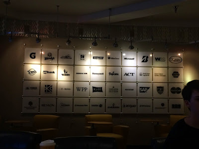
Their conference room is outstanding, really neat how they include all of their current clients on these glass panels.
Some main points that Aaron Evanson mentioned that stuck with me are...
                                                          Set yourself up, be prepared.

No set process, keep on working. 
Make sure you have an awesome portfolio by the end of graduation.
Keep track of all the things you're doing.


Friday, November 7, 2014

Spirograph Tutorial

Awhile back I did the Spirograph tutorial. Super simple to follow only about eight steps. Starts off with just an oval, and then I created an Action function. The Action function allows you to create a pattern over and over. Originally I was just going to do a circle that had multiple colors. Throughout that process I decided to create sort of a "black hole". Dropped a picture of space behind it. Kinda has this 3D effect, feels like the Spirograph is coming towards you. Also at the same time it feels like you're looking into the "black hole". Super simple tut. easy to follow, probably will use that later on a different project.
http://www.photoshoptutorials.ws/photoshop-tutorials/special-effects/quick-tip-create-fun-spirographs-fractals/


Painting in Photoshop


With the first landscape that I did, it came out ok. Defiantly improved on the next two paintings. I didn't even know you could "paint" in photoshop. With the mixer brush, which I didn't know about, any brush with any stroke I can create. It is somewhat weird how realistic some of the photoshop paintings can look. It is not a long process to create these, but as being a begginger it was somewhat of a frustrating process. In the end I like how all of my paintings came out.

Wednesday, October 29, 2014

Plug Project & Bill Brady Gallery Field Trip

The Plug Project was still interesting, even tho they already took the exhibit down. All of the people who run the Plug Project all had a common goal, which was to bring local & out of state artist into 
Kansas City to display their work. And that is a goal that they accomplished.

Same sort of thing applies to Graphic Design. If you create something really unique and new, wouldn't you want as many people as possible to see it? It's the same when creating a logo for a company/school. You take pride in it, and you can say you contributed to the effect of that logo/design taking place. 

Media is considered a form of art. At the Billy Brady Gallery, most of the artwork on display was done through media. Like the banners hanging from the ceiling, the pictures are just pictures from the earth from space. 

Artist: Michael Manning
Kind Of Artwork: Digital Media & Print Media
Literal Objects:
TVs, Wires, Movie Servers, Tapestry.

I noticed the massive canvases first. Right when you walk in, it's the first thing you see. 
He includes a lot of bright colors, that catch your eye. The shapes are completely random, doesn't follow a pattern. It sort of gives this calm mood. I don't know how to say this but peaceful/nature-like? Manning uses a lot of light and dark colors, it creates a sort of depth perception to his artwork.

Even tho all of his artwork was separate "canvases" they all flow together, it's like looking into a world that is divided into sections and each one represents something different. 

Tuesday, October 7, 2014

Anatomy Of Font


Universal is the font I got after watching the video/test. It means that the person is rational, understood, progression, relaxed. I'm a pretty relaxed person, so I could agree with some of these but not all of them. And to start this off, we don't have Universal font so I just picked a random font. The font I picked is Hoefler Text. 


Q1 Final Blog


I made the ONW Theatre logo. Before I met with Murphy, I just threw an idea together, which was a shield with the theatre mask. Then met with her a few times, slight changes...the banner that says "ONW Theatre" was originally below the masks, and the raven was above. Switched it to what it currently looks like, changed the text and little bit. And the picture to the right is the final logo. 


Gradient Logo Mesh:
I combined a little bit of Photoshop into this logo. The armor and tongue I did based off the picture, and tried to match the colors as close as possible. With the custom text, I connected my first name and last name. Filled in the inclosed areas with blue. And made the text look like it was all one solid object. Overall I like the way the final design came out, I learned a lot from the gradient mesh effect and making your own text.


Gold Text Effect:
Simple tutorial, it had about 30 steps. It seems
complicated to do, but it was really easy. It uses 3
effects bevel & emboss, stroke, and outer glow. Nothing
confusing or super complicated, but now I could make
any "metallic"  text. So I did silver, which came out
decently good, I feel like theirs to much glow in the
background.


Tuesday, September 2, 2014

Cubes


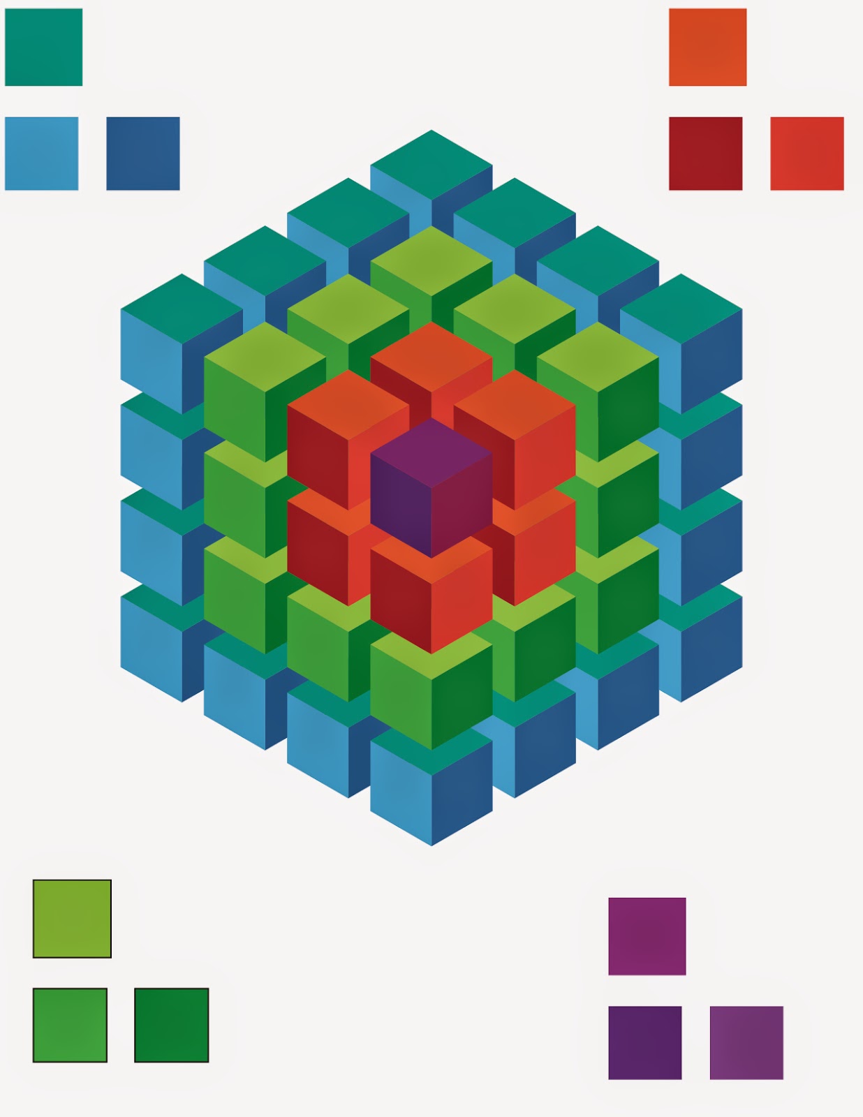
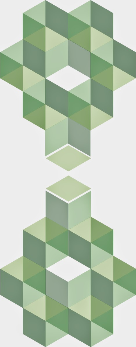
In illustrator we created cubes using the pen tool. Each cube is a combination of lines. The degree of the line is 120. Started out with one line then duplicated it, moved it up, and grouped the lines together to make them square.  Then created a bunch of random cubes and shapes containing cubes.


Friday, August 22, 2014

What does Graphic Design mean?


Graphic design is.....having the freedom to be creative and not limited to certain perspectives. With core classes everyone is required to do the same assignment (usually), but with GD everyone is free to be creative and do the project they want in their own way. An idea can turn into a million ides.

Friday, April 25, 2014

Video Copilot Tutorial


   The tutorial was to create Graffiti Writing, also including a paint ball splatter effect along with it.
I mainly used the paint splatter effect, everything with the animation of the letters can be done without any outside files. With the paint splatters I just changed the color of them to blue and added a color burn effect. It is a very simple tutorial, nothing to complex. The part I enjoyed the most was animating the letters which is done with the pen tool. Overall the entire tutorial is great. I think my final product came out great. 


Friday, April 11, 2014

Kerning

   Kerning is when the space between letters is adjusted to fix the appearance. For example like letters TA, they look better with the spacing adjusted without it it looks like T A. It's more of a visual effect than just the text itself.

Monday, April 7, 2014

eMagine

     Once again eMagine has arrived and is already gone for this year. Entries this year were better than last year. Red vs Blue was my most favorite animation. But overall the greatest entry was The Wall, I felt like I was actually watching a real movie. The feeling of the suspense of their being a prisoner that escaped. The actors and directors of the video did a fantastic job. It wont be long till next year rolls around and then eMagine will arrive again. 

Thursday, April 3, 2014

Movie Poster

    Saul Bass, a famous movie poster designer. He has done many
different poster recreates. In "It's Mad, Mad, Mad, Mad World"
he used a circle as the main object, which is sort of the same thing
I did. I started out with having a ghost in the bottom right corner,
it didn't look right. So I found a picture of a werewolf staring into
the moon. I took out the moon and replaced it with KISS and a park.
Creating "KISS Meets The Phantom Of The Park".

Google Logo


  • Sergey Brin created the Google logo back in 1998.
  • It originally had an exclamation mark to mimic Yahoo!
  • Used primary colors, but had a secondary color on the L.
This version lasted 10 years.


Thursday, March 27, 2014

Plausible Impossible


 Mickey goes right through the mirror, like their is nothing to it. He runs right through with no problem. Its another world, where everything has living characteristics. Now in the real world you cant run through a mirror and be in another dimension, but in the cartoonish side of things anything is possible.
The footrest is more of a dog than a footrest. Mickey steps on it and it goes wild chasing him and barking. And the chair had to hold the footrest back from attacking Mickey. No footrest could get up and attack a person. In animation everything has characteristics depending on what the object is.
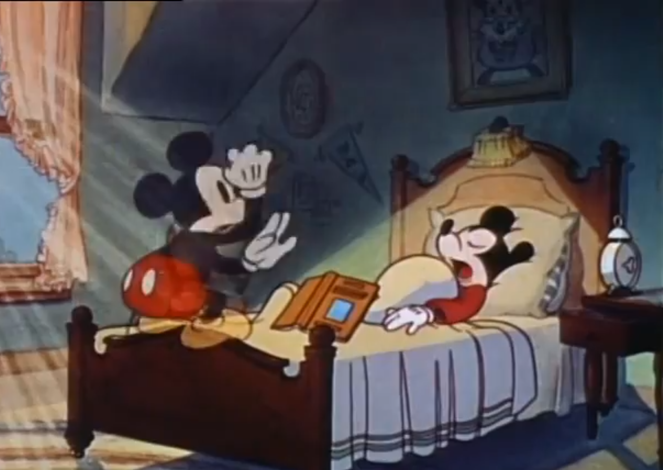


Mickey eats a walnut. Right after he eats it his stomach starts making noise. Causes him to turn into a giant then he shrinks down to the size of a mouse. Now eating anything can make your stomach growl. But it cant make you turn into a giant, and then shrink into a tiny person.

Running back through the mirror, Mickey goes back into the real world. It was all a dream, and goes running back into his body waking up hearing the alarm go off. You can dream, but you cant go right through a mirror and jump back into your body. Its completely impossible but not in the cartoon side of things.


The joker & king are dancing. And the joker is juggling at the same time.
Playing cards cant dance or juggle, its impossible. Also the king's wife (not shown in this pic.)
is dancing with Mickey. No nonliving thing can do this in the real world.
Anything you can dream of or think of is possible to do in the cartoon world.

Thursday, March 13, 2014

Poster Reflective Writing

This poster describes who I am, what I like. To start things off rock n roll has always been in my life and nothing is gonna change that, even 10 years from now I'll still listen to rock. Doing sound for theatre is like my home away from home, I love getting to work with an awesome cast and crew. I'm a windows and apple kinda guy. Steelers are my all time favorite football team, and I will always be a Steelers fan. Also just like Missouri, which my cousins half brother plays for their football team (Shane Ray). Ive been born and raised in Kansas and most likely will stay in Kansas. The Walking Dead by far is one of the greater shows on t.v. And finally Graphic Design lets me express my creativity.

Monday, February 10, 2014

Nerman


This was my first time going to the Nerman. They have a lot of interesting artwork. Kaws work I liked the most, it grabbed your attention. He started out doing graffiti in New York then he did bigger art pieces. The "X's" were his signature on his artwork.