http://www.photoshoptutorials.ws/photoshop-tutorials/special-effects/quick-tip-create-fun-spirographs-fractals/
Friday, November 7, 2014
Spirograph Tutorial
Awhile back I did the Spirograph tutorial. Super simple to follow only about eight steps. Starts off with just an oval, and then I created an Action function. The Action function allows you to create a pattern over and over. Originally I was just going to do a circle that had multiple colors. Throughout that process I decided to create sort of a "black hole". Dropped a picture of space behind it. Kinda has this 3D effect, feels like the Spirograph is coming towards you. Also at the same time it feels like you're looking into the "black hole". Super simple tut. easy to follow, probably will use that later on a different project.
http://www.photoshoptutorials.ws/photoshop-tutorials/special-effects/quick-tip-create-fun-spirographs-fractals/
Painting in Photoshop

With the first landscape that I did, it came out ok. Defiantly improved on the next two paintings. I didn't even know you could "paint" in photoshop. With the mixer brush, which I didn't know about, any brush with any stroke I can create. It is somewhat weird how realistic some of the photoshop paintings can look. It is not a long process to create these, but as being a begginger it was somewhat of a frustrating process. In the end I like how all of my paintings came out.
Wednesday, October 29, 2014
Plug Project & Bill Brady Gallery Field Trip
The Plug Project was still interesting, even tho they already took the exhibit down. All of the people who run the Plug Project all had a common goal, which was to bring local & out of state artist into
Kansas City to display their work. And that is a goal that they accomplished.
Same sort of thing applies to Graphic Design. If you create something really unique and new, wouldn't you want as many people as possible to see it? It's the same when creating a logo for a company/school. You take pride in it, and you can say you contributed to the effect of that logo/design taking place.
Media is considered a form of art. At the Billy Brady Gallery, most of the artwork on display was done through media. Like the banners hanging from the ceiling, the pictures are just pictures from the earth from space.
Artist: Michael Manning
Kind Of Artwork: Digital Media & Print Media
Literal Objects:
TVs, Wires, Movie Servers, Tapestry.
Literal Objects:
TVs, Wires, Movie Servers, Tapestry.
I noticed the massive canvases first. Right when you walk in, it's the first thing you see.
He includes a lot of bright colors, that catch your eye. The shapes are completely random, doesn't follow a pattern. It sort of gives this calm mood. I don't know how to say this but peaceful/nature-like? Manning uses a lot of light and dark colors, it creates a sort of depth perception to his artwork.
Tuesday, October 7, 2014
Anatomy Of Font
Universal is the font I got after watching the video/test. It means that the person is rational, understood, progression, relaxed. I'm a pretty relaxed person, so I could agree with some of these but not all of them. And to start this off, we don't have Universal font so I just picked a random font. The font I picked is Hoefler Text.
Q1 Final Blog
I made the ONW Theatre logo. Before I met with Murphy, I just threw an idea together, which was a shield with the theatre mask. Then met with her a few times, slight changes...the banner that says "ONW Theatre" was originally below the masks, and the raven was above. Switched it to what it currently looks like, changed the text and little bit. And the picture to the right is the final logo.
I combined a little bit of Photoshop into this logo. The armor and tongue I did based off the picture, and tried to match the colors as close as possible. With the custom text, I connected my first name and last name. Filled in the inclosed areas with blue. And made the text look like it was all one solid object. Overall I like the way the final design came out, I learned a lot from the gradient mesh effect and making your own text.
Gold Text Effect:
Simple tutorial, it had about 30 steps. It seems
complicated to do, but it was really easy. It uses 3
effects bevel & emboss, stroke, and outer glow. Nothing
confusing or super complicated, but now I could make
any "metallic" text. So I did silver, which came out
decently good, I feel like theirs to much glow in the
background.
Wednesday, September 24, 2014
Tuesday, September 2, 2014
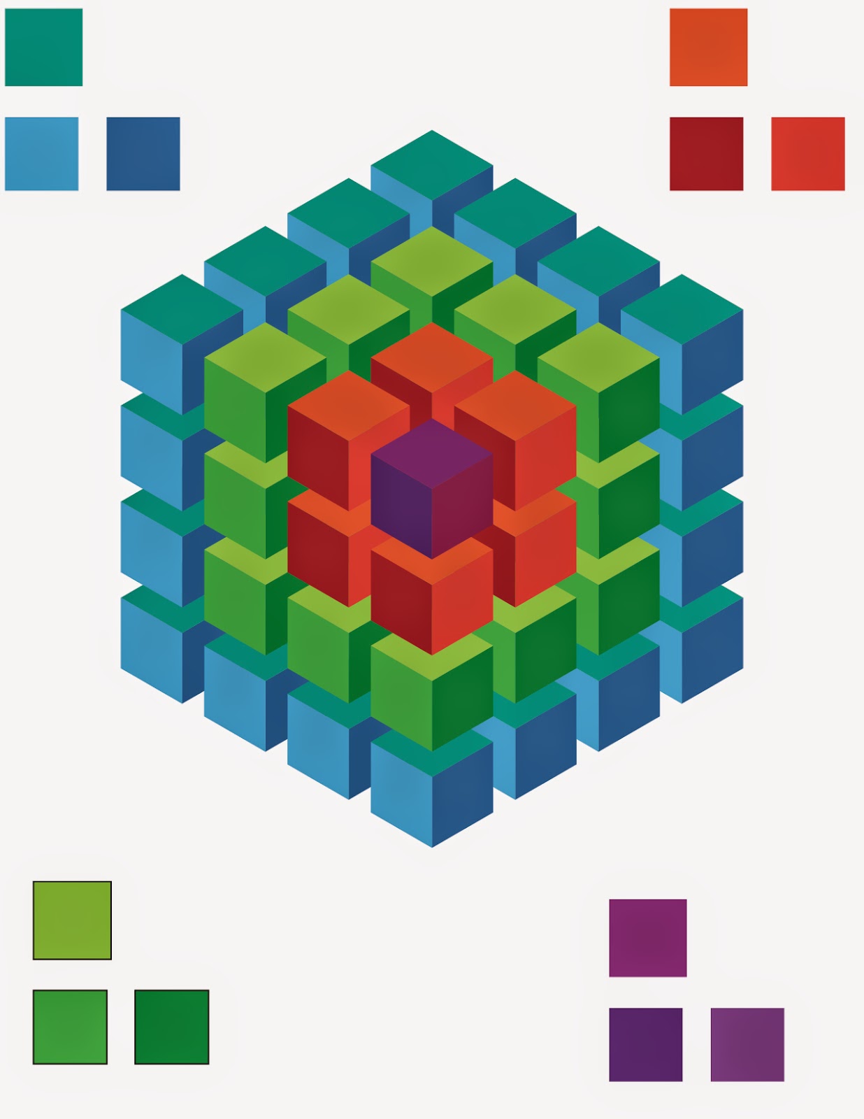
Cubes
Subscribe to:
Posts (Atom)