Tuesday, May 19, 2015
Wednesday, May 13, 2015
Identity Package Design
The final project of the year, to create an identity package design. Consisting of anything that could self brand yourself with from shirts, buttons, business cards and so on.
Inspiration:
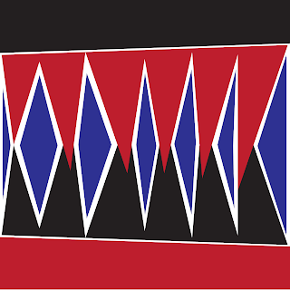
It all came from this. I was bored and started messing around, and this mountain like creation is what formed. Shows a simple yet powerful message, could be jagged rocks off the edge of a cliff or whatever the imagination leads it to.
Goal:
I wanted to create something geometric. Simple shapes consisting of a square and triangle. The colors fall together and create an interlocking bond. Pantone had just released the spring color palette at the time, which the colors I picked fall into the current "professional" standards. Red, light green, and green are colors that stand out and the shades I picked have a neon type feel to them, but not blinding. Goes well together with anything, any color. It consist of button's, t-shirt, business card, artist card, letter head, and a sticky note.
It all came from this. I was bored and started messing around, and this mountain like creation is what formed. Shows a simple yet powerful message, could be jagged rocks off the edge of a cliff or whatever the imagination leads it to.
I wanted to create something geometric. Simple shapes consisting of a square and triangle. The colors fall together and create an interlocking bond. Pantone had just released the spring color palette at the time, which the colors I picked fall into the current "professional" standards. Red, light green, and green are colors that stand out and the shades I picked have a neon type feel to them, but not blinding. Goes well together with anything, any color. It consist of button's, t-shirt, business card, artist card, letter head, and a sticky note.
Font: Baron Neue
Tuesday, May 5, 2015
Gear: The Final Frontier
Gear For Sports
Logo:

Very simple, nothing elaborate but it gets the point across of who they are and what they do. Hidden message within the g forming the letter s, standing for their company name.
Brand:
Started in 1974, based in Kansas and still is today.
Now owned by the Hanes Company.
One of the most cleanest print shops in the business.
Put out 15,000 shirts a day.
In-house print shop.
Customers:
Under Armor

Gear For Sports

Champion

Identity:
"Guided by our GEAR values, we strive to be the leader in quality and delivery of our customer’s image through marketing innovative sportswear, accessories and services." Having some major well known companies, Champion, Under Armour and Gear For Sports owned by Gear and rolling out 15,000 shirts/articles of clothing a day. They show that through the many different departments of their business. Part of it is that they have a wall with the latest trends, keeping up to date with whats "fresh".Their graphic designers go out and take pictures of anything at malls/stores seeing whats new and applying back into what they may be working on. Also it was very interesting how they have their color palette displayed, two shirts showing all their colors on a light/dark variant. Also with their start being back in 1974, and being around today shows that they know what they're doing. Any company that has been around for that long, it shows that they are moving forward and keeping up to date with what is current. All of this shows their identity without really just sticking to them as Gear but to them as a company as a whole working towards one goal.
Website: http://www.gearforsports.com
Logo:

Very simple, nothing elaborate but it gets the point across of who they are and what they do. Hidden message within the g forming the letter s, standing for their company name.
Brand:
Started in 1974, based in Kansas and still is today.
Now owned by the Hanes Company.
One of the most cleanest print shops in the business.
Put out 15,000 shirts a day.
In-house print shop.
Customers:
Under Armor

Gear For Sports

Champion

Identity:
"Guided by our GEAR values, we strive to be the leader in quality and delivery of our customer’s image through marketing innovative sportswear, accessories and services." Having some major well known companies, Champion, Under Armour and Gear For Sports owned by Gear and rolling out 15,000 shirts/articles of clothing a day. They show that through the many different departments of their business. Part of it is that they have a wall with the latest trends, keeping up to date with whats "fresh".Their graphic designers go out and take pictures of anything at malls/stores seeing whats new and applying back into what they may be working on. Also it was very interesting how they have their color palette displayed, two shirts showing all their colors on a light/dark variant. Also with their start being back in 1974, and being around today shows that they know what they're doing. Any company that has been around for that long, it shows that they are moving forward and keeping up to date with what is current. All of this shows their identity without really just sticking to them as Gear but to them as a company as a whole working towards one goal.
Website: http://www.gearforsports.com
Subscribe to:
Comments (Atom)


